Field House Museum
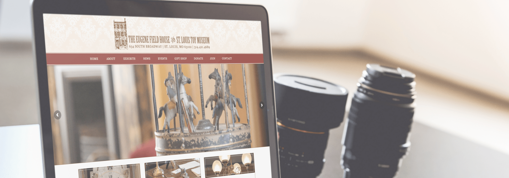
For this website redesign the client wanted an updated look. It was top priority that information about the museum be more accessible to visitors – “hours and admission” are the most prominently called out. Wayne shot all of the big photos you see throughout the site. They wanted to use their brand colors brown and red – but the feel of the site to be bright and open like their museum, so we used them as accents. We also set up and photographed the inventory for their Square e-commerce shopping cart found in the “Gift Shop” tab.


