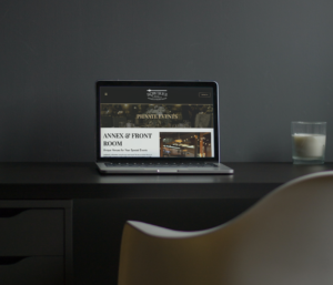
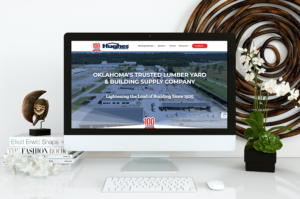
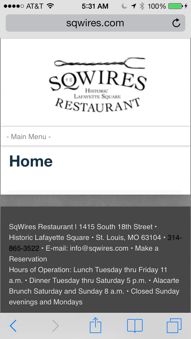
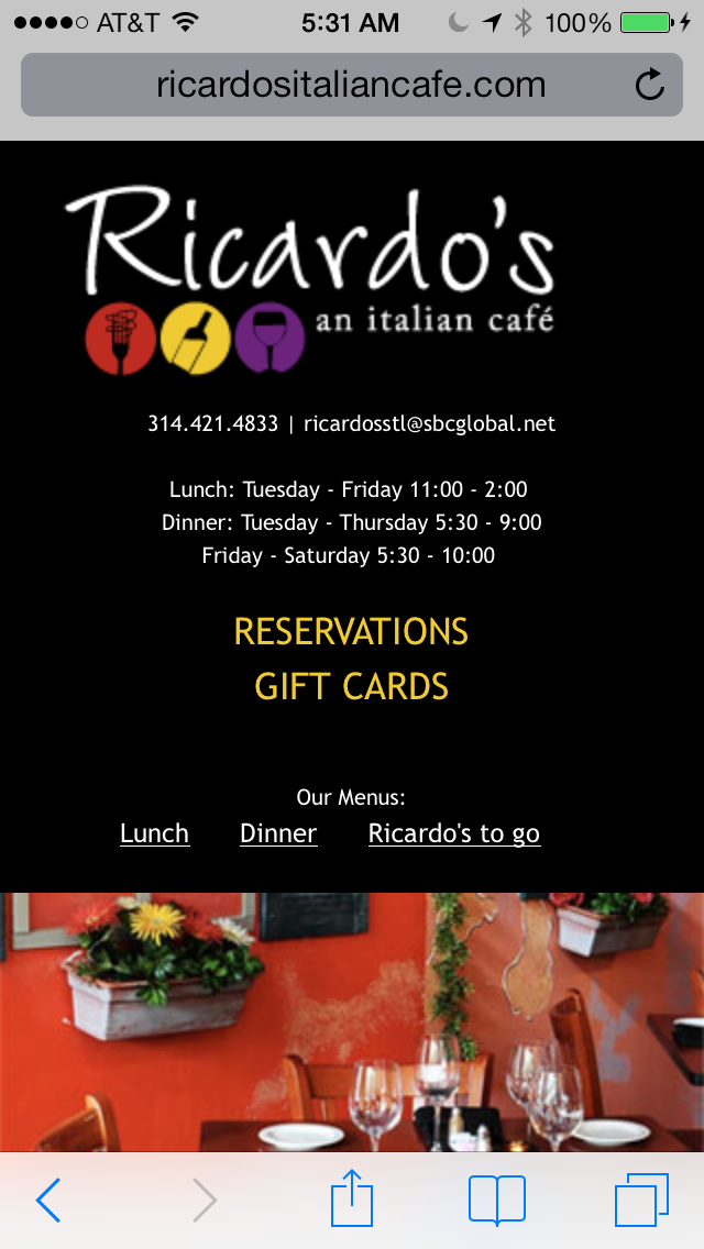
Responsive WordPress Websites
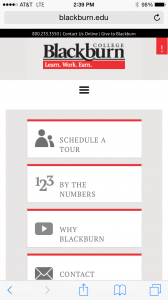
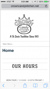
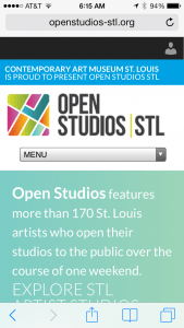
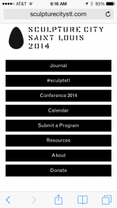
At Studio 2108, we are aware of the importance of staying up-to-date with the current web design trends and adapting to our clients’ ever-changing needs. We’re excited to showcase a few of the responsive WordPress websites that we’ve recently launched for our clients.
Responsive web design is the idea that the layout and content on the website responds based on the size of the device that it’s being view on. A responsive website automatically adjusts its layout for the best display on each device. Typical responsive designs are formatted differently for the desktop, tablet, and mobile phone.
Below are some example responsive WordPress websites that we’ve created. You can view the screenshots below, check the websites on different devices, or simply drag the bottom right corner of your browser to see the websites respond to different screen sizes.